ElementUI
版本:2.15.6
官方参考链接:https://element.eleme.io/#/zh-CN/component/installation
安装

如果网络超时,重新安装一遍
基本使用
完全引入(全量引入)
在 main.js 中写入以下内容:
1
2
3
4
5
6
7
8
9
10
11
| import Vue from 'vue';
import ElementUI from 'element-ui';
import 'element-ui/lib/theme-chalk/index.css';
import App from './App.vue';
Vue.use(ElementUI);
new Vue({
el: '#app',
render: h => h(App)
});
|
以上代码便完成了 Element 的引入。需要注意的是,样式文件需要单独引入。
按需引入(增量引入)
借助 babel-plugin-component,我们可以只引入需要的组件,以达到减小项目体积的目的。
首先,安装 babel-plugin-component:
1
| npm install babel-plugin-component -D
|
然后,将 .babelrc 修改为:
1
2
3
4
5
6
7
8
9
10
11
12
| {
"presets": [["es2015", { "modules": false }]],
"plugins": [
[
"component",
{
"libraryName": "element-ui",
"styleLibraryName": "theme-chalk"
}
]
]
}
|
如果没有.babelrc,应该有babel.config.js
原来的内容
1
2
3
4
5
| module.exports = {
presets: [
'@vue/cli-plugin-babel/preset'
]
}
|
修改如下:
1
2
3
4
5
6
7
8
9
10
11
12
13
14
15
16
| module.exports = {
presets: [
'@vue/cli-plugin-babel/preset',
["es2015", { "modules": false }]
],
plugins: [
[
"component",
{
"libraryName": "element-ui",
"styleLibraryName": "theme-chalk"
}
]
]
}
|
然后这个配置在后面运行时会报错: Cannot find module 'babel-preset-es2015'
1
| npm install babel-preset-es2015 -D
|
然后将 babel.config.js 的 es2015 修改成 @babel/preset-env,修改过后重新启动就可以了
接下来,如果你只希望引入部分组件,比如 Button 和 Select,那么需要在 main.js 中写入以下内容:
1
2
3
4
5
6
7
8
9
10
11
12
13
14
15
16
17
18
19
| import Vue from 'vue';
import { Button, Select } from 'element-ui';
import App from './App.vue';
Vue.use(Button).use(Select);
new Vue({
el: '#app',
render: h => h(App)
});
|
在js文件中按需引入
1
2
3
4
5
6
| import {Message} from 'element-ui';
Message({
message:'认证失效,请重新登录',
type: 'warning'
})
|
用到的每一个标签,你都要去引入,不是看你用了什么组件,而是看你用了什么标签
部分标签的引入方式不是通过 use 而是直接在 Vue 的原型上绑定,比如说 Message
1
2
3
4
5
6
7
8
9
| Vue.use(Loading.directive);
Vue.prototype.$loading = Loading.service;
Vue.prototype.$msgbox = MessageBox;
Vue.prototype.$alert = MessageBox.alert;
Vue.prototype.$confirm = MessageBox.confirm;
Vue.prototype.$prompt = MessageBox.prompt;
Vue.prototype.$notify = Notification;
Vue.prototype.$message = Message;
|
这里官方文档也有说明,具体就是要仔细看
还有就是这种绑定在原型上的就不要去在写一次 use 不然可能会造成无缘无故的 bug
更彻底的按需引入:
使用解析
layout布局
通过基础的 24 分栏,迅速简便地创建布局。
基础布局
官方案例
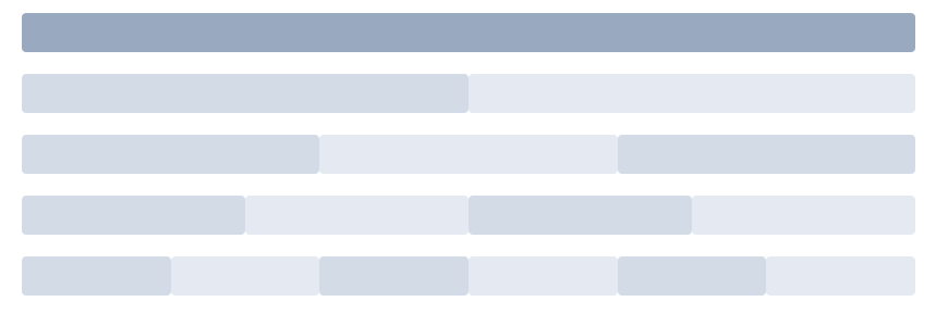
使用单一分栏创建基础的栅格布局。
通过 row 和 col 组件,并通过 col 组件的 span 属性我们就可以自由地组合布局。
1
2
3
4
5
6
7
8
9
10
11
12
13
14
15
16
17
18
19
20
21
22
23
24
25
26
27
28
29
30
31
32
33
34
35
36
37
38
39
40
41
42
43
44
45
46
47
48
49
50
51
52
53
54
55
| <el-row>
<el-col :span="24"><div class="grid-content bg-purple-dark"></div></el-col>
</el-row>
<el-row>
<el-col :span="12"><div class="grid-content bg-purple"></div></el-col>
<el-col :span="12"><div class="grid-content bg-purple-light"></div></el-col>
</el-row>
<el-row>
<el-col :span="8"><div class="grid-content bg-purple"></div></el-col>
<el-col :span="8"><div class="grid-content bg-purple-light"></div></el-col>
<el-col :span="8"><div class="grid-content bg-purple"></div></el-col>
</el-row>
<el-row>
<el-col :span="6"><div class="grid-content bg-purple"></div></el-col>
<el-col :span="6"><div class="grid-content bg-purple-light"></div></el-col>
<el-col :span="6"><div class="grid-content bg-purple"></div></el-col>
<el-col :span="6"><div class="grid-content bg-purple-light"></div></el-col>
</el-row>
<el-row>
<el-col :span="4"><div class="grid-content bg-purple"></div></el-col>
<el-col :span="4"><div class="grid-content bg-purple-light"></div></el-col>
<el-col :span="4"><div class="grid-content bg-purple"></div></el-col>
<el-col :span="4"><div class="grid-content bg-purple-light"></div></el-col>
<el-col :span="4"><div class="grid-content bg-purple"></div></el-col>
<el-col :span="4"><div class="grid-content bg-purple-light"></div></el-col>
</el-row>
<style>
.el-row {
margin-bottom: 20px;
&:last-child {
margin-bottom: 0;
}
}
.el-col {
border-radius: 4px;
}
.bg-purple-dark {
background: #99a9bf;
}
.bg-purple {
background: #d3dce6;
}
.bg-purple-light {
background: #e5e9f2;
}
.grid-content {
border-radius: 4px;
min-height: 36px;
}
.row-bg {
padding: 10px 0;
background-color: #f9fafc;
}
</style>
|
解析
分栏间隔
官方案例

分栏之间存在间隔。
Row 组件 提供 gutter 属性来指定每一栏之间的间隔,默认间隔为 0。
1
2
3
4
5
6
7
8
9
10
11
12
13
14
15
16
17
18
19
20
21
22
23
24
25
26
27
28
29
30
31
32
33
34
35
| <el-row :gutter="20">
<el-col :span="6"><div class="grid-content bg-purple"></div></el-col>
<el-col :span="6"><div class="grid-content bg-purple"></div></el-col>
<el-col :span="6"><div class="grid-content bg-purple"></div></el-col>
<el-col :span="6"><div class="grid-content bg-purple"></div></el-col>
</el-row>
<style>
.el-row {
margin-bottom: 20px;
&:last-child {
margin-bottom: 0;
}
}
.el-col {
border-radius: 4px;
}
.bg-purple-dark {
background: #99a9bf;
}
.bg-purple {
background: #d3dce6;
}
.bg-purple-light {
background: #e5e9f2;
}
.grid-content {
border-radius: 4px;
min-height: 36px;
}
.row-bg {
padding: 10px 0;
background-color: #f9fafc;
}
</style>
|
解析
混合布局
官方案例
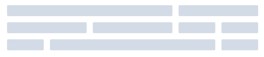
通过基础的 1/24 分栏任意扩展组合形成较为复杂的混合布局。
1
2
3
4
5
6
7
8
9
10
11
12
13
14
15
16
17
18
19
20
21
22
23
24
25
26
27
28
29
30
31
32
33
34
35
36
37
38
39
40
41
42
43
44
| <el-row :gutter="20">
<el-col :span="16"><div class="grid-content bg-purple"></div></el-col>
<el-col :span="8"><div class="grid-content bg-purple"></div></el-col>
</el-row>
<el-row :gutter="20">
<el-col :span="8"><div class="grid-content bg-purple"></div></el-col>
<el-col :span="8"><div class="grid-content bg-purple"></div></el-col>
<el-col :span="4"><div class="grid-content bg-purple"></div></el-col>
<el-col :span="4"><div class="grid-content bg-purple"></div></el-col>
</el-row>
<el-row :gutter="20">
<el-col :span="4"><div class="grid-content bg-purple"></div></el-col>
<el-col :span="16"><div class="grid-content bg-purple"></div></el-col>
<el-col :span="4"><div class="grid-content bg-purple"></div></el-col>
</el-row>
<style>
.el-row {
margin-bottom: 20px;
&:last-child {
margin-bottom: 0;
}
}
.el-col {
border-radius: 4px;
}
.bg-purple-dark {
background: #99a9bf;
}
.bg-purple {
background: #d3dce6;
}
.bg-purple-light {
background: #e5e9f2;
}
.grid-content {
border-radius: 4px;
min-height: 36px;
}
.row-bg {
padding: 10px 0;
background-color: #f9fafc;
}
</style>
|
解析
- 保证每个
row组件的col组件的span属性值,加起来是24即可
分栏偏移
官方案例
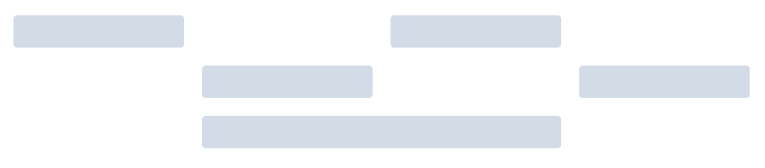
支持偏移指定的栏数。
通过制定 col 组件的 offset 属性可以指定分栏偏移的栏数。
1
2
3
4
5
6
7
8
9
10
11
12
13
14
15
16
17
18
19
20
21
22
23
24
25
26
27
28
29
30
31
32
33
34
35
36
37
38
39
40
| <el-row :gutter="20">
<el-col :span="6"><div class="grid-content bg-purple"></div></el-col>
<el-col :span="6" :offset="6"><div class="grid-content bg-purple"></div></el-col>
</el-row>
<el-row :gutter="20">
<el-col :span="6" :offset="6"><div class="grid-content bg-purple"></div></el-col>
<el-col :span="6" :offset="6"><div class="grid-content bg-purple"></div></el-col>
</el-row>
<el-row :gutter="20">
<el-col :span="12" :offset="6"><div class="grid-content bg-purple"></div></el-col>
</el-row>
<style>
.el-row {
margin-bottom: 20px;
&:last-child {
margin-bottom: 0;
}
}
.el-col {
border-radius: 4px;
}
.bg-purple-dark {
background: #99a9bf;
}
.bg-purple {
background: #d3dce6;
}
.bg-purple-light {
background: #e5e9f2;
}
.grid-content {
border-radius: 4px;
min-height: 36px;
}
.row-bg {
padding: 10px 0;
background-color: #f9fafc;
}
</style>
|
解析
对齐方式(flex布局)
官方案例
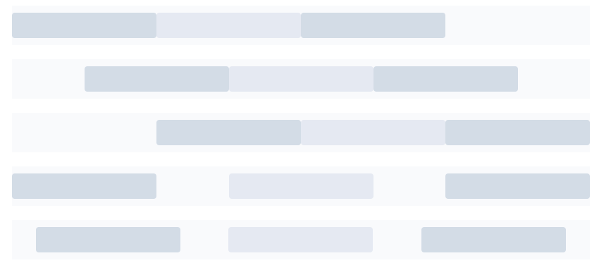
通过 flex 布局来对分栏进行灵活的对齐。
将 type 属性赋值为 ‘flex’,可以启用 flex 布局,并可通过 justify 属性来指定 start, center, end, space-between, space-around 其中的值来定义子元素的排版方式。
1
2
3
4
5
6
7
8
9
10
11
12
13
14
15
16
17
18
19
20
21
22
23
24
25
26
27
28
29
30
31
32
33
34
35
36
37
38
39
40
41
42
43
44
45
46
47
48
49
50
51
52
53
54
| <el-row type="flex" class="row-bg">
<el-col :span="6"><div class="grid-content bg-purple"></div></el-col>
<el-col :span="6"><div class="grid-content bg-purple-light"></div></el-col>
<el-col :span="6"><div class="grid-content bg-purple"></div></el-col>
</el-row>
<el-row type="flex" class="row-bg" justify="center">
<el-col :span="6"><div class="grid-content bg-purple"></div></el-col>
<el-col :span="6"><div class="grid-content bg-purple-light"></div></el-col>
<el-col :span="6"><div class="grid-content bg-purple"></div></el-col>
</el-row>
<el-row type="flex" class="row-bg" justify="end">
<el-col :span="6"><div class="grid-content bg-purple"></div></el-col>
<el-col :span="6"><div class="grid-content bg-purple-light"></div></el-col>
<el-col :span="6"><div class="grid-content bg-purple"></div></el-col>
</el-row>
<el-row type="flex" class="row-bg" justify="space-between">
<el-col :span="6"><div class="grid-content bg-purple"></div></el-col>
<el-col :span="6"><div class="grid-content bg-purple-light"></div></el-col>
<el-col :span="6"><div class="grid-content bg-purple"></div></el-col>
</el-row>
<el-row type="flex" class="row-bg" justify="space-around">
<el-col :span="6"><div class="grid-content bg-purple"></div></el-col>
<el-col :span="6"><div class="grid-content bg-purple-light"></div></el-col>
<el-col :span="6"><div class="grid-content bg-purple"></div></el-col>
</el-row>
<style>
.el-row {
margin-bottom: 20px;
&:last-child {
margin-bottom: 0;
}
}
.el-col {
border-radius: 4px;
}
.bg-purple-dark {
background: #99a9bf;
}
.bg-purple {
background: #d3dce6;
}
.bg-purple-light {
background: #e5e9f2;
}
.grid-content {
border-radius: 4px;
min-height: 36px;
}
.row-bg {
padding: 10px 0;
background-color: #f9fafc;
}
</style>
|
解析
- 官方用了所谓的
对齐方式一次,来描述flex布局
- 其实只实现了水平的
flex布局的基本功能
响应式布局
官方案例
参照了 Bootstrap 的 响应式设计,预设了五个响应尺寸:xs、sm、md、lg 和 xl。

1
2
3
4
5
6
7
8
9
10
11
12
13
14
15
16
17
18
19
20
21
22
23
24
25
26
27
28
29
30
31
32
33
34
35
36
37
38
39
40
41
| <el-row :gutter="10">
<el-col :xs="8" :sm="6" :md="4" :lg="3" :xl="1">
<div class="grid-content bg-purple">
左边侧边栏
</div>
</el-col>
<el-col :xs="4" :sm="6" :md="8" :lg="9" :xl="11">
<div class="grid-content bg-purple-light">
内容区域1
</div>
</el-col>
<el-col :xs="4" :sm="6" :md="8" :lg="9" :xl="11">
<div class="grid-content bg-purple">
内容区域2
</div>
</el-col>
<el-col :xs="8" :sm="6" :md="4" :lg="3" :xl="1">
<div class="grid-content bg-purple-light">
右边导航栏
</div>
</el-col>
</el-row>
<style>
.el-col {
border-radius: 4px;
}
.bg-purple-dark {
background: #99a9bf;
}
.bg-purple {
background: #d3dce6;
}
.bg-purple-light {
background: #e5e9f2;
}
.grid-content {
border-radius: 4px;
min-height: 36px;
}
</style>
|
解析
基于不同的屏幕尺寸下,同一行的各列的布局分布
| 参数 |
说明 |
| xs |
<768px 响应式栅格数或者栅格属性对象 |
| sm |
≥768px 响应式栅格数或者栅格属性对象 |
| md |
≥992px 响应式栅格数或者栅格属性对象 |
| lg |
≥1200px 响应式栅格数或者栅格属性对象 |
| xl |
≥1920px 响应式栅格数或者栅格属性对象 |
基于断点的隐藏类
官方说明
Element 额外提供了一系列类名,用于在某些条件下隐藏元素。这些类名可以添加在任何 DOM 元素或自定义组件上。如果需要,请自行引入以下文件:
1
| import 'element-ui/lib/theme-chalk/display.css';
|
包含的类名及其含义为:
hidden-xs-only - 当视口在 xs 尺寸时隐藏hidden-sm-only - 当视口在 sm 尺寸时隐藏hidden-sm-and-down - 当视口在 sm 及以下尺寸时隐藏hidden-sm-and-up - 当视口在 sm 及以上尺寸时隐藏hidden-md-only - 当视口在 md 尺寸时隐藏hidden-md-and-down - 当视口在 md 及以下尺寸时隐藏hidden-md-and-up - 当视口在 md 及以上尺寸时隐藏hidden-lg-only - 当视口在 lg 尺寸时隐藏hidden-lg-and-down - 当视口在 lg 及以下尺寸时隐藏hidden-lg-and-up - 当视口在 lg 及以上尺寸时隐藏hidden-xl-only - 当视口在 xl 尺寸时隐藏
解析
- 在上面案例的基础上,可以通过添加类名,隐藏指定尺寸下的任意一个元素
查询手册
Row Attributes
| 参数 |
说明 |
类型 |
可选值 |
默认值 |
| gutter |
栅格间隔 |
number |
— |
0 |
| type |
布局模式,可选 flex,现代浏览器下有效 |
string |
— |
— |
| justify |
flex 布局下的水平排列方式 |
string |
start/end/center/space-around/space-between |
start |
| align |
flex 布局下的垂直排列方式 |
string |
top/middle/bottom |
— |
| tag |
自定义元素标签 |
string |
* |
div |
Col Attributes
| 参数 |
说明 |
类型 |
可选值 |
默认值 |
| span |
栅格占据的列数 |
number |
— |
24 |
| offset |
栅格左侧的间隔格数 |
number |
— |
0 |
| push |
栅格向右移动格数 |
number |
— |
0 |
| pull |
栅格向左移动格数 |
number |
— |
0 |
| xs |
<768px 响应式栅格数或者栅格属性对象 |
number/object (例如: {span: 4, offset: 4}) |
— |
— |
| sm |
≥768px 响应式栅格数或者栅格属性对象 |
number/object (例如: {span: 4, offset: 4}) |
— |
— |
| md |
≥992px 响应式栅格数或者栅格属性对象 |
number/object (例如: {span: 4, offset: 4}) |
— |
— |
| lg |
≥1200px 响应式栅格数或者栅格属性对象 |
number/object (例如: {span: 4, offset: 4}) |
— |
— |
| xl |
≥1920px 响应式栅格数或者栅格属性对象 |
number/object (例如: {span: 4, offset: 4}) |
— |
— |
| tag |
自定义元素标签 |
string |
* |
div |
常用的操作按钮。
基础用法
官方案例
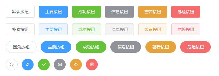
使用type、plain、round和circle属性来定义 Button 的样式。
1
2
3
4
5
6
7
8
9
10
11
12
13
14
15
16
17
18
19
20
21
22
23
24
25
26
27
28
29
30
31
32
33
34
35
| <el-row>
<el-button>默认按钮</el-button>
<el-button type="primary">主要按钮</el-button>
<el-button type="success">成功按钮</el-button>
<el-button type="info">信息按钮</el-button>
<el-button type="warning">警告按钮</el-button>
<el-button type="danger">危险按钮</el-button>
</el-row>
<el-row>
<el-button plain>朴素按钮</el-button>
<el-button type="primary" plain>主要按钮</el-button>
<el-button type="success" plain>成功按钮</el-button>
<el-button type="info" plain>信息按钮</el-button>
<el-button type="warning" plain>警告按钮</el-button>
<el-button type="danger" plain>危险按钮</el-button>
</el-row>
<el-row>
<el-button round>圆角按钮</el-button>
<el-button type="primary" round>主要按钮</el-button>
<el-button type="success" round>成功按钮</el-button>
<el-button type="info" round>信息按钮</el-button>
<el-button type="warning" round>警告按钮</el-button>
<el-button type="danger" round>危险按钮</el-button>
</el-row>
<el-row>
<el-button icon="el-icon-search" circle></el-button>
<el-button type="primary" icon="el-icon-edit" circle></el-button>
<el-button type="success" icon="el-icon-check" circle></el-button>
<el-button type="info" icon="el-icon-message" circle></el-button>
<el-button type="warning" icon="el-icon-star-off" circle></el-button>
<el-button type="danger" icon="el-icon-delete" circle></el-button>
</el-row>
|
解析
禁用状态
你可以使用disabled属性来定义按钮是否可用,它接受一个Boolean值。
1
| <el-button disabled>默认按钮</el-button>
|
TimePicker 时间选择器
DatePicker 日期选择器
用于选择或输入日期
选择日
官方案例
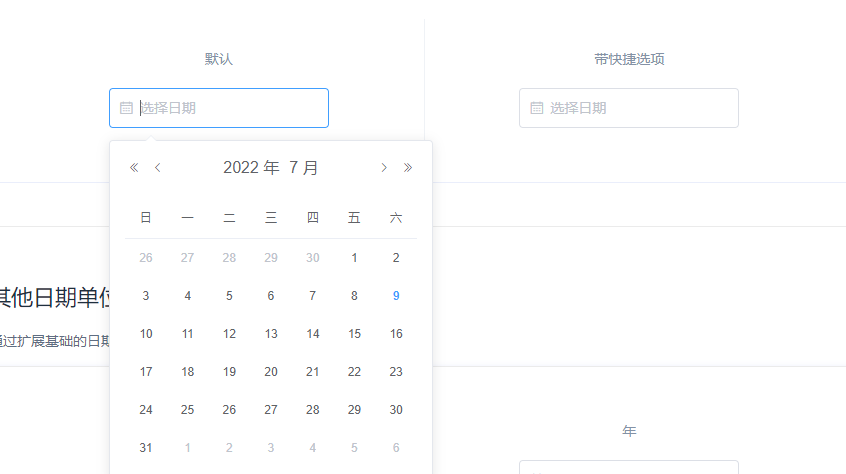
基本单位由type属性指定。快捷选项需配置picker-options对象中的shortcuts,禁用日期通过 disabledDate 设置,传入函数
1
2
3
4
5
6
7
8
9
10
11
12
13
14
15
16
17
18
19
20
21
22
23
24
25
26
27
28
29
30
31
32
33
34
35
36
37
38
39
40
41
42
43
44
45
46
47
48
49
50
51
52
53
54
55
56
| <template>
<div class="block">
<span class="demonstration">默认</span>
<el-date-picker
v-model="value1"
type="date"
placeholder="选择日期">
</el-date-picker>
</div>
<div class="block">
<span class="demonstration">带快捷选项</span>
<el-date-picker
v-model="value2"
align="right"
type="date"
placeholder="选择日期"
:picker-options="pickerOptions">
</el-date-picker>
</div>
</template>
<script>
export default {
data() {
return {
pickerOptions: {
disabledDate(time) {
return time.getTime() > Date.now();
},
shortcuts: [{
text: '今天',
onClick(picker) {
picker.$emit('pick', new Date());
}
}, {
text: '昨天',
onClick(picker) {
const date = new Date();
date.setTime(date.getTime() - 3600 * 1000 * 24);
picker.$emit('pick', date);
}
}, {
text: '一周前',
onClick(picker) {
const date = new Date();
date.setTime(date.getTime() - 3600 * 1000 * 24 * 7);
picker.$emit('pick', date);
}
}]
},
value1: '',
value2: '',
};
}
};
</script>
|
解析
通过鼠标或键盘输入字符
Input 为受控组件,它总会显示 Vue 绑定值。
通常情况下,应当处理 input 事件,并更新组件的绑定值(或使用v-model)。否则,输入框内显示的值将不会改变。
不支持 v-model 修饰符。
基础用法
1
2
3
4
5
6
7
8
9
10
11
| <el-input v-model="input" placeholder="请输入内容"></el-input>
<script>
export default {
data() {
return {
input: ''
}
}
}
</script>
|
可清空
使用clearable属性即可得到一个可清空的输入框
1
2
3
4
5
6
7
8
9
10
11
12
13
14
15
| <el-input
placeholder="请输入内容"
v-model="input"
clearable>
</el-input>
<script>
export default {
data() {
return {
input: ''
}
}
}
</script>
|
尺寸
可通过 size 属性指定输入框的尺寸,除了默认的大小外,还提供了 medium、small 和 mini 三种尺寸。

1
2
3
4
5
6
7
8
9
10
11
12
13
14
15
16
17
18
19
20
21
22
23
24
25
26
27
28
29
30
31
32
33
34
35
36
37
38
| <div class="demo-input-size">
<el-input
placeholder="请输入内容"
suffix-icon="el-icon-date"
v-model="input1">
</el-input>
<el-input
size="medium"
placeholder="请输入内容"
suffix-icon="el-icon-date"
v-model="input2">
</el-input>
<el-input
size="small"
placeholder="请输入内容"
suffix-icon="el-icon-date"
v-model="input3">
</el-input>
<el-input
size="mini"
placeholder="请输入内容"
suffix-icon="el-icon-date"
v-model="input4">
</el-input>
</div>
<script>
export default {
data() {
return {
input1: '',
input2: '',
input3: '',
input4: ''
}
}
}
</script>
|
Select 选择器
当选项过多时,使用下拉菜单展示并选择内容。
基础用法
适用广泛的基础单选
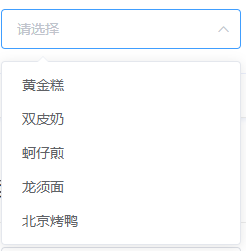
v-model的值为当前被选中的el-option的 value 属性值
1
2
3
4
5
6
7
8
9
10
11
12
13
14
15
16
17
18
19
20
21
22
23
24
25
26
27
28
29
30
31
32
33
34
35
36
| <template>
<el-select v-model="value" placeholder="请选择">
<el-option
v-for="item in options"
:key="item.value"
:label="item.label"
:value="item.value">
</el-option>
</el-select>
</template>
<script>
export default {
data() {
return {
options: [{
value: '选项1',
label: '黄金糕'
}, {
value: '选项2',
label: '双皮奶'
}, {
value: '选项3',
label: '蚵仔煎'
}, {
value: '选项4',
label: '龙须面'
}, {
value: '选项5',
label: '北京烤鸭'
}],
value: ''
}
}
}
</script>
|
事件
由输入框、选择器、单选框、多选框等控件组成,用以收集、校验、提交数据
典型表单
官方案例
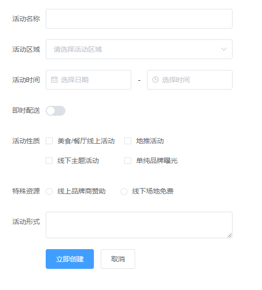
包括各种表单项,比如输入框、选择器、开关、单选框、多选框等。
W3C 标准中有如下规定:
When there is only one single-line text input field in a form, the user agent should accept Enter in that field as a request to submit the form.
即:当一个 form 元素中只有一个输入框时,在该输入框中按下回车应提交该表单。如果希望阻止这一默认行为,可以在 <el-form> 标签上添加 @submit.native.prevent。
在 Form 组件中,每一个表单域由一个 Form-Item 组件构成,表单域中可以放置各种类型的表单控件,包括 Input、Select、Checkbox、Radio、Switch、DatePicker、TimePicker
1
2
3
4
5
6
7
8
9
10
11
12
13
14
15
16
17
18
19
20
21
22
23
24
25
26
27
28
29
30
31
32
33
34
35
36
37
38
39
40
41
42
43
44
45
46
47
48
49
50
51
52
53
54
55
56
57
58
59
60
61
62
63
64
65
66
67
| <el-form ref="form" :model="form" label-width="80px">
<el-form-item label="活动名称">
<el-input v-model="form.name"></el-input>
</el-form-item>
<el-form-item label="活动区域">
<el-select v-model="form.region" placeholder="请选择活动区域">
<el-option label="区域一" value="shanghai"></el-option>
<el-option label="区域二" value="beijing"></el-option>
</el-select>
</el-form-item>
<el-form-item label="活动时间">
<el-col :span="11">
<el-date-picker type="date" placeholder="选择日期" v-model="form.date1" style="width: 100%;"></el-date-picker>
</el-col>
<el-col class="line" :span="2">-</el-col>
<el-col :span="11">
<el-time-picker placeholder="选择时间" v-model="form.date2" style="width: 100%;"></el-time-picker>
</el-col>
</el-form-item>
<el-form-item label="即时配送">
<el-switch v-model="form.delivery"></el-switch>
</el-form-item>
<el-form-item label="活动性质">
<el-checkbox-group v-model="form.type">
<el-checkbox label="美食/餐厅线上活动" name="type"></el-checkbox>
<el-checkbox label="地推活动" name="type"></el-checkbox>
<el-checkbox label="线下主题活动" name="type"></el-checkbox>
<el-checkbox label="单纯品牌曝光" name="type"></el-checkbox>
</el-checkbox-group>
</el-form-item>
<el-form-item label="特殊资源">
<el-radio-group v-model="form.resource">
<el-radio label="线上品牌商赞助"></el-radio>
<el-radio label="线下场地免费"></el-radio>
</el-radio-group>
</el-form-item>
<el-form-item label="活动形式">
<el-input type="textarea" v-model="form.desc"></el-input>
</el-form-item>
<el-form-item>
<el-button type="primary" @click="onSubmit">立即创建</el-button>
<el-button>取消</el-button>
</el-form-item>
</el-form>
<script>
export default {
data() {
return {
form: {
name: '',
region: '',
date1: '',
date2: '',
delivery: false,
type: [],
resource: '',
desc: ''
}
}
},
methods: {
onSubmit() {
console.log('submit!');
}
}
}
</script>
|
解析
el-form绑定一个对象el-form-item表示表单的每一个行,内部可以嵌套其他元素label-width属性控制的是表单字段的宽度
行内表单
官方案例

当垂直方向空间受限且表单较简单时,可以在一行内放置表单。
设置 inline 属性可以让表单域变为行内的表单域
1
2
3
4
5
6
7
8
9
10
11
12
13
14
15
16
17
18
19
20
21
22
23
24
25
26
27
28
29
30
31
| <el-form :inline="true" :model="formInline" class="demo-form-inline">
<el-form-item label="审批人">
<el-input v-model="formInline.user" placeholder="审批人"></el-input>
</el-form-item>
<el-form-item label="活动区域">
<el-select v-model="formInline.region" placeholder="活动区域">
<el-option label="区域一" value="shanghai"></el-option>
<el-option label="区域二" value="beijing"></el-option>
</el-select>
</el-form-item>
<el-form-item>
<el-button type="primary" @click="onSubmit">查询</el-button>
</el-form-item>
</el-form>
<script>
export default {
data() {
return {
formInline: {
user: '',
region: ''
}
}
},
methods: {
onSubmit() {
console.log('submit!');
}
}
}
</script>
|
解析
- 在表单中实现,一行可以配置多字段,不能通过
el-col的形式实现
查询手册
Form Attributes
| 参数 |
说明 |
类型 |
可选值 |
默认值 |
| model |
表单数据对象 |
object |
— |
— |
| rules |
表单验证规则 |
object |
— |
— |
| inline |
行内表单模式 |
boolean |
— |
false |
| label-position |
表单域标签的位置,如果值为 left 或者 right 时,则需要设置 label-width |
string |
right/left/top |
right |
| label-width |
表单域标签的宽度,例如 ‘50px’。作为 Form 直接子元素的 form-item 会继承该值。支持 auto。 |
string |
— |
— |
| label-suffix |
表单域标签的后缀 |
string |
— |
— |
| hide-required-asterisk |
是否隐藏必填字段的标签旁边的红色星号 |
boolean |
— |
false |
| show-message |
是否显示校验错误信息 |
boolean |
— |
true |
| inline-message |
是否以行内形式展示校验信息 |
boolean |
— |
false |
| status-icon |
是否在输入框中显示校验结果反馈图标 |
boolean |
— |
false |
| validate-on-rule-change |
是否在 rules 属性改变后立即触发一次验证 |
boolean |
— |
true |
| size |
用于控制该表单内组件的尺寸 |
string |
medium / small / mini |
— |
| disabled |
是否禁用该表单内的所有组件。若设置为 true,则表单内组件上的 disabled 属性不再生效 |
boolean |
— |
false |
Form Methods
| 方法名 |
说明 |
参数 |
| validate |
对整个表单进行校验的方法,参数为一个回调函数。该回调函数会在校验结束后被调用,并传入两个参数:是否校验成功和未通过校验的字段。若不传入回调函数,则会返回一个 promise |
Function(callback: Function(boolean, object)) |
| validateField |
对部分表单字段进行校验的方法 |
Function(props: array | string, callback: Function(errorMessage: string)) |
| resetFields |
对整个表单进行重置,将所有字段值重置为初始值并移除校验结果 |
— |
| clearValidate |
移除表单项的校验结果。传入待移除的表单项的 prop 属性或者 prop 组成的数组,如不传则移除整个表单的校验结果 |
Function(props: array | string) |
Form Events
| 事件名称 |
说明 |
回调参数 |
| validate |
任一表单项被校验后触发 |
被校验的表单项 prop 值,校验是否通过,错误消息(如果存在) |
Form-Item Attributes
| 参数 |
说明 |
类型 |
可选值 |
默认值 |
| prop |
表单域 model 字段,在使用 validate、resetFields 方法的情况下,该属性是必填的 |
string |
传入 Form 组件的 model 中的字段 |
— |
| label |
标签文本 |
string |
— |
— |
| label-width |
表单域标签的的宽度,例如 ‘50px’。支持 auto。 |
string |
— |
— |
| required |
是否必填,如不设置,则会根据校验规则自动生成 |
boolean |
— |
false |
| rules |
表单验证规则 |
object |
— |
— |
| error |
表单域验证错误信息, 设置该值会使表单验证状态变为error,并显示该错误信息 |
string |
— |
— |
| show-message |
是否显示校验错误信息 |
boolean |
— |
true |
| inline-message |
以行内形式展示校验信息 |
boolean |
— |
false |
| size |
用于控制该表单域下组件的尺寸 |
string |
medium / small / mini |
- |
Form-Item Slot
| name |
说明 |
| — |
Form Item 的内容 |
| label |
标签文本的内容 |
Form-Item Scoped Slot
| name |
说明 |
| error |
自定义表单校验信息的显示方式,参数为 { error } |
Form-Item Methods
| 方法名 |
说明 |
参数 |
| resetField |
对该表单项进行重置,将其值重置为初始值并移除校验结果 |
- |
| clearValidate |
移除该表单项的校验结果 |
- |
Table表格
用于展示多条结构类似的数据,可对数据进行排序、筛选、对比或其他自定义操作。
基础表格
官方案例
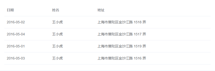
基础的表格展示用法。
当el-table元素中注入data对象数组后,在el-table-column中用prop属性来对应对象中的键名即可填入数据,用label属性来定义表格的列名。可以使用width属性来定义列宽。
1
2
3
4
5
6
7
8
9
10
11
12
13
14
15
16
17
18
19
20
21
22
23
24
25
26
27
28
29
30
31
32
33
34
35
36
37
38
39
40
41
42
43
44
45
46
| <template>
<el-table
:data="tableData"
style="width: 100%">
<el-table-column
prop="date"
label="日期"
width="180">
</el-table-column>
<el-table-column
prop="name"
label="姓名"
width="180">
</el-table-column>
<el-table-column
prop="address"
label="地址">
</el-table-column>
</el-table>
</template>
<script>
export default {
data() {
return {
tableData: [{
date: '2016-05-02',
name: '王小虎',
address: '上海市普陀区金沙江路 1518 弄'
}, {
date: '2016-05-04',
name: '王小虎',
address: '上海市普陀区金沙江路 1517 弄'
}, {
date: '2016-05-01',
name: '王小虎',
address: '上海市普陀区金沙江路 1519 弄'
}, {
date: '2016-05-03',
name: '王小虎',
address: '上海市普陀区金沙江路 1516 弄'
}]
}
}
}
</script>
|
解析
带斑马纹表格
stripe属性可以创建带斑马纹的表格。它接受一个Boolean,默认为false,设置为true即为启用。
1
2
3
4
5
| <el-table
:data="tableData"
stripe
style="width: 100%">
</el-table>
|
带边框表格
默认情况下,Table 组件是不具有竖直方向的边框的,如果需要,可以使用border属性,它接受一个Boolean,设置为true即可启用。
1
2
3
4
5
| <el-table
:data="tableData"
border
style="width: 100%">
</el-table>
|
使用注意点,最好一开始就确定好要不要加边框,不然后面还得调整宽度
固定表头
纵向内容过多时,可选择固定表头。
只要在el-table元素中定义了height属性,即可实现固定表头的表格,而不需要额外的代码。
1
2
3
4
5
| <el-table
:data="tableData"
height="250"
style="width: 100%">
</el-table>
|
固定列
固定列和表头
流体高度
当数据量动态变化时,可以为 Table 设置一个最大高度。
通过设置max-height属性为 Table 指定最大高度。此时若表格所需的高度大于最大高度,则会显示一个滚动条。
多级表头
自定义列模板
自定义列的显示内容,可组合其他组件使用。
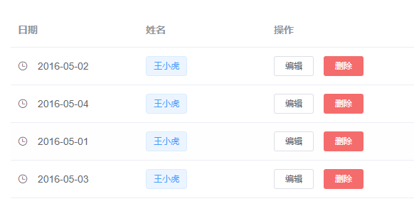
通过 Scoped slot 可以获取到 row, column, $index 和 store(table 内部的状态管理)的数据,用法参考 demo。
1
2
3
4
5
6
7
8
9
10
11
12
13
14
15
16
17
18
19
20
21
22
23
24
25
26
27
28
29
30
31
32
33
34
35
36
37
38
39
40
41
42
43
44
45
46
47
48
49
50
51
52
53
54
55
56
57
58
59
60
61
62
63
64
65
66
67
68
69
70
71
72
| <template>
<el-table
:data="tableData"
style="width: 100%">
<el-table-column
label="日期"
width="180">
<template slot-scope="scope">
<i class="el-icon-time"></i>
<span style="margin-left: 10px">{{ scope.row.date }}</span>
</template>
</el-table-column>
<el-table-column
label="姓名"
width="180">
<template slot-scope="scope">
<el-popover trigger="hover" placement="top">
<p>姓名: {{ scope.row.name }}</p>
<p>住址: {{ scope.row.address }}</p>
<div slot="reference" class="name-wrapper">
<el-tag size="medium">{{ scope.row.name }}</el-tag>
</div>
</el-popover>
</template>
</el-table-column>
<el-table-column label="操作">
<template slot-scope="scope">
<el-button
size="mini"
@click="handleEdit(scope.$index, scope.row)">编辑</el-button>
<el-button
size="mini"
type="danger"
@click="handleDelete(scope.$index, scope.row)">删除</el-button>
</template>
</el-table-column>
</el-table>
</template>
<script>
export default {
data() {
return {
tableData: [{
date: '2016-05-02',
name: '王小虎',
address: '上海市普陀区金沙江路 1518 弄'
}, {
date: '2016-05-04',
name: '王小虎',
address: '上海市普陀区金沙江路 1517 弄'
}, {
date: '2016-05-01',
name: '王小虎',
address: '上海市普陀区金沙江路 1519 弄'
}, {
date: '2016-05-03',
name: '王小虎',
address: '上海市普陀区金沙江路 1516 弄'
}]
}
},
methods: {
handleEdit(index, row) {
console.log(index, row);
},
handleDelete(index, row) {
console.log(index, row);
}
}
}
</script>
|
展开行
当行内容过多并且不想显示横向滚动条时,可以使用 Table 展开行功能。
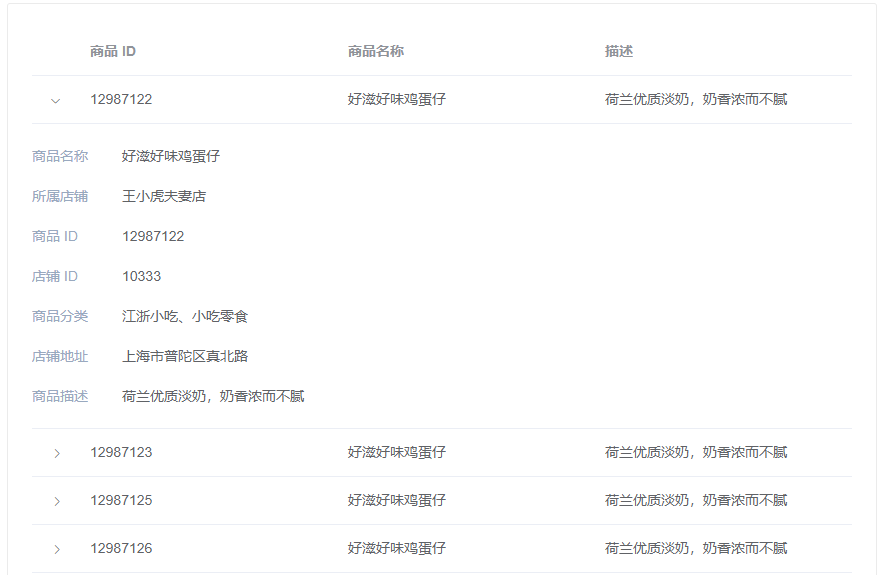
Table Attributes
| 参数 |
说明 |
类型 |
可选值 |
默认值 |
| data |
显示的数据 |
array |
— |
— |
| height |
Table 的高度,默认为自动高度。如果 height 为 number 类型,单位 px;如果 height 为 string 类型,则这个高度会设置为 Table 的 style.height 的值,Table 的高度会受控于外部样式。 |
string/number |
— |
— |
| max-height |
Table 的最大高度。合法的值为数字或者单位为 px 的高度。 |
string/number |
— |
— |
| stripe |
是否为斑马纹 table |
boolean |
— |
false |
| border |
是否带有纵向边框 |
boolean |
— |
false |
| size |
Table 的尺寸 |
string |
medium / small / mini |
— |
| fit |
列的宽度是否自撑开 |
boolean |
— |
true |
| show-header |
是否显示表头 |
boolean |
— |
true |
| current-row-key |
当前行的 key,只写属性 |
String,Number |
— |
— |
| row-class-name |
行的 className 的回调方法,也可以使用字符串为所有行设置一个固定的 className。 |
Function({row, rowIndex})/String |
— |
— |
| row-style |
行的 style 的回调方法,也可以使用一个固定的 Object 为所有行设置一样的 Style。 |
Function({row, rowIndex})/Object |
— |
— |
| cell-class-name |
单元格的 className 的回调方法,也可以使用字符串为所有单元格设置一个固定的 className。 |
Function({row, column, rowIndex, columnIndex})/String |
— |
— |
| cell-style |
单元格的 style 的回调方法,也可以使用一个固定的 Object 为所有单元格设置一样的 Style。 |
Function({row, column, rowIndex, columnIndex})/Object |
— |
— |
| header-row-class-name |
表头行的 className 的回调方法,也可以使用字符串为所有表头行设置一个固定的 className。 |
Function({row, rowIndex})/String |
— |
— |
| header-row-style |
表头行的 style 的回调方法,也可以使用一个固定的 Object 为所有表头行设置一样的 Style。 |
Function({row, rowIndex})/Object |
— |
— |
| header-cell-class-name |
表头单元格的 className 的回调方法,也可以使用字符串为所有表头单元格设置一个固定的 className。 |
Function({row, column, rowIndex, columnIndex})/String |
— |
— |
| header-cell-style |
表头单元格的 style 的回调方法,也可以使用一个固定的 Object 为所有表头单元格设置一样的 Style。 |
Function({row, column, rowIndex, columnIndex})/Object |
— |
— |
拓展
表格数据横向显示
https://www.jb51.net/article/257473.htm
单选
多选
选择多行数据时使用 Checkbox。
官方案例
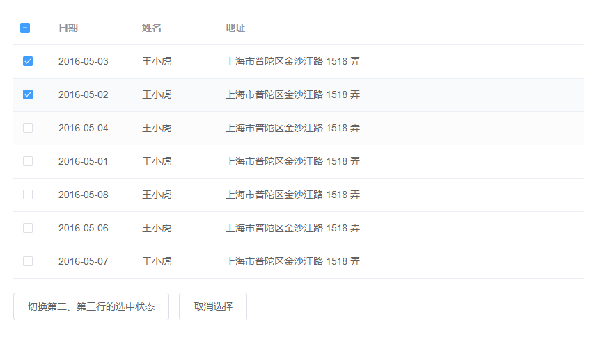
实现多选非常简单: 手动添加一个el-table-column,设type属性为selection即可;默认情况下若内容过多会折行显示,若需要单行显示可以使用show-overflow-tooltip属性,它接受一个Boolean,为true时多余的内容会在 hover 时以 tooltip 的形式显示出来。
1
2
3
4
5
6
7
8
9
10
11
12
13
14
15
16
17
18
19
20
21
22
23
24
25
26
27
28
29
30
31
32
33
34
35
36
37
38
39
40
41
42
43
44
45
46
47
48
49
50
51
52
53
54
55
56
57
58
59
60
61
62
63
64
65
66
67
68
69
70
71
72
73
74
75
76
77
78
79
80
81
82
83
84
85
86
| <template>
<el-table
ref="multipleTable"
:data="tableData"
tooltip-effect="dark"
style="width: 100%"
@selection-change="handleSelectionChange">
<el-table-column
type="selection"
width="55">
</el-table-column>
<el-table-column
label="日期"
width="120">
<template slot-scope="scope">{{ scope.row.date }}</template>
</el-table-column>
<el-table-column
prop="name"
label="姓名"
width="120">
</el-table-column>
<el-table-column
prop="address"
label="地址"
show-overflow-tooltip>
</el-table-column>
</el-table>
<div style="margin-top: 20px">
<el-button @click="toggleSelection([tableData[1], tableData[2]])">切换第二、第三行的选中状态</el-button>
<el-button @click="toggleSelection()">取消选择</el-button>
</div>
</template>
<script>
export default {
data() {
return {
tableData: [{
date: '2016-05-03',
name: '王小虎',
address: '上海市普陀区金沙江路 1518 弄'
}, {
date: '2016-05-02',
name: '王小虎',
address: '上海市普陀区金沙江路 1518 弄'
}, {
date: '2016-05-04',
name: '王小虎',
address: '上海市普陀区金沙江路 1518 弄'
}, {
date: '2016-05-01',
name: '王小虎',
address: '上海市普陀区金沙江路 1518 弄'
}, {
date: '2016-05-08',
name: '王小虎',
address: '上海市普陀区金沙江路 1518 弄'
}, {
date: '2016-05-06',
name: '王小虎',
address: '上海市普陀区金沙江路 1518 弄'
}, {
date: '2016-05-07',
name: '王小虎',
address: '上海市普陀区金沙江路 1518 弄'
}],
multipleSelection: []
}
},
methods: {
toggleSelection(rows) {
if (rows) {
rows.forEach(row => {
this.$refs.multipleTable.toggleRowSelection(row);
});
} else {
this.$refs.multipleTable.clearSelection();
}
},
handleSelectionChange(val) {
this.multipleSelection = val;
}
}
}
</script>
|
解析
自定义列模板
官方案例
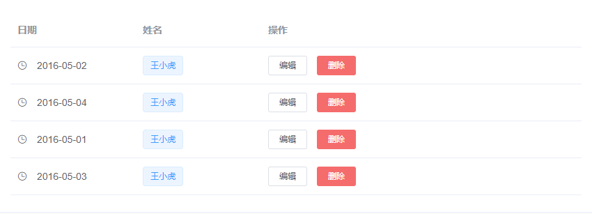
自定义列的显示内容,可组合其他组件使用。
通过 Scoped slot 可以获取到 row, column, $index 和 store(table 内部的状态管理)的数据,用法参考 demo。
1
2
3
4
5
6
7
8
9
10
11
12
13
14
15
16
17
18
19
20
21
22
23
24
25
26
27
28
29
30
31
32
33
34
35
36
37
38
39
40
41
42
43
44
45
46
47
48
49
50
51
52
53
54
55
56
57
58
59
60
61
62
63
64
65
66
67
68
69
70
71
72
| <template>
<el-table
:data="tableData"
style="width: 100%">
<el-table-column
label="日期"
width="180">
<template slot-scope="scope">
<i class="el-icon-time"></i>
<span style="margin-left: 10px">{{ scope.row.date }}</span>
</template>
</el-table-column>
<el-table-column
label="姓名"
width="180">
<template slot-scope="scope">
<el-popover trigger="hover" placement="top">
<p>姓名: {{ scope.row.name }}</p>
<p>住址: {{ scope.row.address }}</p>
<div slot="reference" class="name-wrapper">
<el-tag size="medium">{{ scope.row.name }}</el-tag>
</div>
</el-popover>
</template>
</el-table-column>
<el-table-column label="操作">
<template slot-scope="scope">
<el-button
size="mini"
@click="handleEdit(scope.$index, scope.row)">编辑</el-button>
<el-button
size="mini"
type="danger"
@click="handleDelete(scope.$index, scope.row)">删除</el-button>
</template>
</el-table-column>
</el-table>
</template>
<script>
export default {
data() {
return {
tableData: [{
date: '2016-05-02',
name: '王小虎',
address: '上海市普陀区金沙江路 1518 弄'
}, {
date: '2016-05-04',
name: '王小虎',
address: '上海市普陀区金沙江路 1517 弄'
}, {
date: '2016-05-01',
name: '王小虎',
address: '上海市普陀区金沙江路 1519 弄'
}, {
date: '2016-05-03',
name: '王小虎',
address: '上海市普陀区金沙江路 1516 弄'
}]
}
},
methods: {
handleEdit(index, row) {
console.log(index, row);
},
handleDelete(index, row) {
console.log(index, row);
}
}
}
</script>
|
解析
使用了作用域插槽,拿到el-table-column传递给使用者的数据
1
2
3
4
| <template slot-scope="scope">
<i class="el-icon-time"></i>
<span style="margin-left: 10px">{{ scope.row.date }}</span>
</template>
|
可以获取到 row, column, $index 和 store(table 内部的状态管理)的数据
scope.row
scope.column
scope.$index
scope.store,直接这样取会报错
也就是说我们要在表格里写自定义的内容,要用到它这个作用域插槽,并且如果要自定义内容,就不要加prop属性了
展开行
官方案例
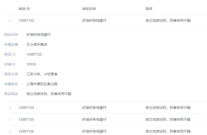
当行内容过多并且不想显示横向滚动条时,可以使用 Table 展开行功能。
通过设置 type=”expand” 和 Scoped slot 可以开启展开行功能,el-table-column 的模板会被渲染成为展开行的内容,展开行可访问的属性与使用自定义列模板时的 Scoped slot 相同。
1
2
3
4
5
6
7
8
9
10
11
12
13
14
15
16
17
18
19
20
21
22
23
24
25
26
27
28
29
30
31
32
33
34
35
36
37
38
39
40
41
42
43
44
45
46
47
48
49
50
51
52
53
54
55
56
57
58
59
60
61
62
63
64
65
66
67
68
69
70
71
72
73
74
75
76
77
78
79
80
81
82
83
84
85
86
87
88
89
90
91
92
93
94
95
96
97
98
99
100
101
102
| <template>
<el-table
:data="tableData"
style="width: 100%">
<el-table-column type="expand">
<template slot-scope="props">
<el-form label-position="left" inline class="demo-table-expand">
<el-form-item label="商品名称">
<span>{{ props.row.name }}</span>
</el-form-item>
<el-form-item label="所属店铺">
<span>{{ props.row.shop }}</span>
</el-form-item>
<el-form-item label="商品 ID">
<span>{{ props.row.id }}</span>
</el-form-item>
<el-form-item label="店铺 ID">
<span>{{ props.row.shopId }}</span>
</el-form-item>
<el-form-item label="商品分类">
<span>{{ props.row.category }}</span>
</el-form-item>
<el-form-item label="店铺地址">
<span>{{ props.row.address }}</span>
</el-form-item>
<el-form-item label="商品描述">
<span>{{ props.row.desc }}</span>
</el-form-item>
</el-form>
</template>
</el-table-column>
<el-table-column
label="商品 ID"
prop="id">
</el-table-column>
<el-table-column
label="商品名称"
prop="name">
</el-table-column>
<el-table-column
label="描述"
prop="desc">
</el-table-column>
</el-table>
</template>
<style>
.demo-table-expand {
font-size: 0;
}
.demo-table-expand label {
width: 90px;
color: #99a9bf;
}
.demo-table-expand .el-form-item {
margin-right: 0;
margin-bottom: 0;
width: 50%;
}
</style>
<script>
export default {
data() {
return {
tableData: [{
id: '12987122',
name: '好滋好味鸡蛋仔',
category: '江浙小吃、小吃零食',
desc: '荷兰优质淡奶,奶香浓而不腻',
address: '上海市普陀区真北路',
shop: '王小虎夫妻店',
shopId: '10333'
}, {
id: '12987123',
name: '好滋好味鸡蛋仔',
category: '江浙小吃、小吃零食',
desc: '荷兰优质淡奶,奶香浓而不腻',
address: '上海市普陀区真北路',
shop: '王小虎夫妻店',
shopId: '10333'
}, {
id: '12987125',
name: '好滋好味鸡蛋仔',
category: '江浙小吃、小吃零食',
desc: '荷兰优质淡奶,奶香浓而不腻',
address: '上海市普陀区真北路',
shop: '王小虎夫妻店',
shopId: '10333'
}, {
id: '12987126',
name: '好滋好味鸡蛋仔',
category: '江浙小吃、小吃零食',
desc: '荷兰优质淡奶,奶香浓而不腻',
address: '上海市普陀区真北路',
shop: '王小虎夫妻店',
shopId: '10333'
}]
}
}
}
</script>
|
解析
el-table-column使用了type属性,值为expand,同时配合作用域插槽自定义内容,官方案例中展开的结构,是用了一个表单
自定义表头
表头支持自定义。
官方案例
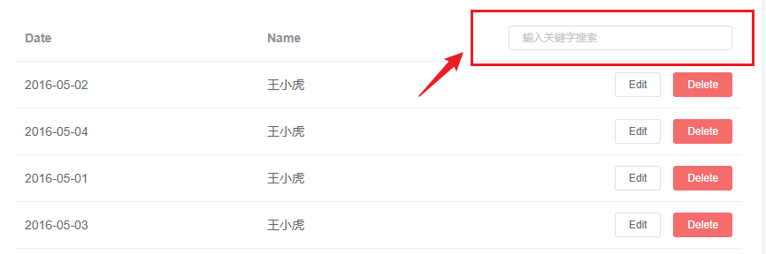
通过设置 Scoped slot 来自定义表头。
1
2
3
4
5
6
7
8
9
10
11
12
13
14
15
16
17
18
19
20
21
22
23
24
25
26
27
28
29
30
31
32
33
34
35
36
37
38
39
40
41
42
43
44
45
46
47
48
49
50
51
52
53
54
55
56
57
58
59
60
61
62
63
64
65
66
67
| <template>
<el-table
:data="tableData.filter(data => !search || data.name.toLowerCase().includes(search.toLowerCase()))"
style="width: 100%">
<el-table-column
label="Date"
prop="date">
</el-table-column>
<el-table-column
label="Name"
prop="name">
</el-table-column>
<el-table-column
align="right">
<template slot="header" slot-scope="scope">
<el-input
v-model="search"
size="mini"
placeholder="输入关键字搜索"/>
</template>
<template slot-scope="scope">
<el-button
size="mini"
@click="handleEdit(scope.$index, scope.row)">Edit</el-button>
<el-button
size="mini"
type="danger"
@click="handleDelete(scope.$index, scope.row)">Delete</el-button>
</template>
</el-table-column>
</el-table>
</template>
<script>
export default {
data() {
return {
tableData: [{
date: '2016-05-02',
name: '王小虎',
address: '上海市普陀区金沙江路 1518 弄'
}, {
date: '2016-05-04',
name: '王小虎',
address: '上海市普陀区金沙江路 1517 弄'
}, {
date: '2016-05-01',
name: '王小虎',
address: '上海市普陀区金沙江路 1519 弄'
}, {
date: '2016-05-03',
name: '王小虎',
address: '上海市普陀区金沙江路 1516 弄'
}],
search: ''
}
},
methods: {
handleEdit(index, row) {
console.log(index, row);
},
handleDelete(index, row) {
console.log(index, row);
}
},
}
</script>
|
解析
核心代码
1
2
3
4
5
6
7
8
9
| <template slot="header" slot-scope="scope">
<el-button
size="mini"
type="danger"
@click.native.prevent="deleteSelectedRow(userList)">移除选中
</el-button>
</template>
<template slot-scope="scope">
</template>
|
通过slot="header"来自定义表头
可以配合多选,来删除多条记录
1
2
3
4
| deleteSelectedRow(userList) {
userList.splice(0, userList.length)
},
|
当数据量过多时,使用分页分解数据。
基础用法
官方案例
设置layout,表示需要显示的内容,用逗号分隔,布局元素会依次显示。prev表示上一页,next为下一页,pager表示页码列表,除此以外还提供了jumper和total,size和特殊的布局符号->,->后的元素会靠右显示,jumper表示跳页元素,total表示总条目数,size用于设置每页显示的页码数量。

1
2
3
4
5
6
7
8
9
10
11
12
13
14
| <div class="block">
<span class="demonstration">页数较少时的效果</span>
<el-pagination
layout="prev, pager, next"
:total="50">
</el-pagination>
</div>
<div class="block">
<span class="demonstration">大于 7 页时的效果</span>
<el-pagination
layout="prev, pager, next"
:total="1000">
</el-pagination>
</div>
|
解析
- 就是一个
el-pagination组件,接收layout属性,值为prev, pager, next
设置最大页码按钮数
默认情况下,当总页数超过 7 页时,Pagination 会折叠多余的页码按钮。通过pager-count属性可以设置最大页码按钮数。
1
2
3
4
5
6
| <el-pagination
:page-size="20"
:pager-count="11"
layout="prev, pager, next"
:total="1000">
</el-pagination>
|
就是表示可点击的页码出现几个
带有背景色的分页
设置background属性可以为分页按钮添加背景色。
1
2
3
4
5
| <el-pagination
background
layout="prev, pager, next"
:total="1000">
</el-pagination>
|
附加功能
根据场景需要,可以添加其他功能模块。
Dialog对话框
在保留当前页面状态的情况下,告知用户并承载相关操作。
基本用法
官方案例
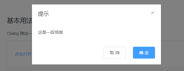
Dialog 弹出一个对话框,适合需要定制性更大的场景。
需要设置visible属性,它接收Boolean,当为true时显示 Dialog。
Dialog 分为两个部分:body和footer,footer需要具名为footer的slot。
title属性用于定义标题,它是可选的,默认值为空。
最后,本例还展示了before-close的用法。
1
2
3
4
5
6
7
8
9
10
11
12
13
14
15
16
17
18
19
20
21
22
23
24
25
26
27
28
29
30
31
32
| <el-button type="text" @click="dialogVisible = true">点击打开 Dialog</el-button>
<el-dialog
title="提示"
:visible.sync="dialogVisible"
width="30%"
:before-close="handleClose">
<span>这是一段信息</span>
<span slot="footer" class="dialog-footer">
<el-button @click="dialogVisible = false">取 消</el-button>
<el-button type="primary" @click="dialogVisible = false">确 定</el-button>
</span>
</el-dialog>
<script>
export default {
data() {
return {
dialogVisible: false
};
},
methods: {
handleClose(done) {
this.$confirm('确认关闭?')
.then(_ => {
done();
})
.catch(_ => {});
}
}
};
</script>
|
before-close 仅当用户通过点击关闭图标或遮罩关闭 Dialog 时起效。如果你在 footer 具名 slot 里添加了用于关闭 Dialog 的按钮,那么可以在按钮的点击回调函数里加入 before-close 的相关逻辑。
解析
el-dialog
title:对话框的标题:visible:绑定控制显隐的布尔值变量width:控制对话框的宽度before-close:关闭对话框的回调(注意触发条件)
自定义内容
官方案例
Dialog 组件的内容可以是任意的,甚至可以是表格或表单,下面是应用了 Element Table 和 Form 组件的两个样例。

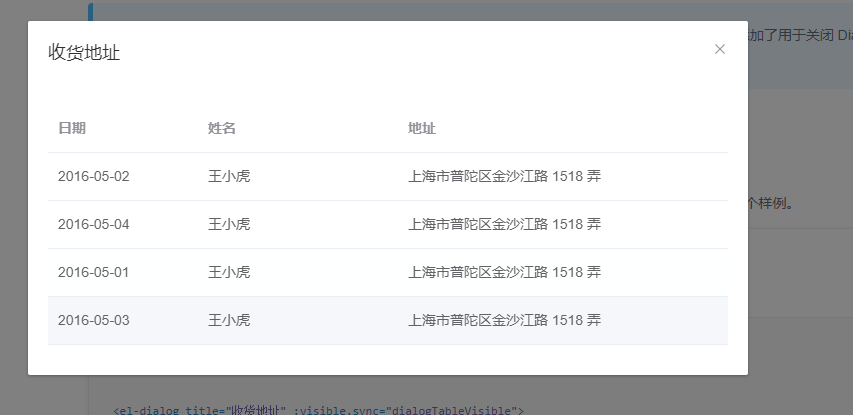
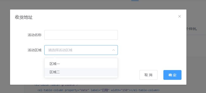
1
2
3
4
5
6
7
8
9
10
11
12
13
14
15
16
17
18
19
20
21
22
23
24
25
26
27
28
29
30
31
32
33
34
35
36
37
38
39
40
41
42
43
44
45
46
47
48
49
50
51
52
53
54
55
56
57
58
59
60
61
62
63
64
65
66
67
68
69
70
| <!-- Table -->
<el-button type="text" @click="dialogTableVisible = true">打开嵌套表格的 Dialog</el-button>
<el-dialog title="收货地址" :visible.sync="dialogTableVisible">
<el-table :data="gridData">
<el-table-column property="date" label="日期" width="150"></el-table-column>
<el-table-column property="name" label="姓名" width="200"></el-table-column>
<el-table-column property="address" label="地址"></el-table-column>
</el-table>
</el-dialog>
<!-- Form -->
<el-button type="text" @click="dialogFormVisible = true">打开嵌套表单的 Dialog</el-button>
<el-dialog title="收货地址" :visible.sync="dialogFormVisible">
<el-form :model="form">
<el-form-item label="活动名称" :label-width="formLabelWidth">
<el-input v-model="form.name" autocomplete="off"></el-input>
</el-form-item>
<el-form-item label="活动区域" :label-width="formLabelWidth">
<el-select v-model="form.region" placeholder="请选择活动区域">
<el-option label="区域一" value="shanghai"></el-option>
<el-option label="区域二" value="beijing"></el-option>
</el-select>
</el-form-item>
</el-form>
<div slot="footer" class="dialog-footer">
<el-button @click="dialogFormVisible = false">取 消</el-button>
<el-button type="primary" @click="dialogFormVisible = false">确 定</el-button>
</div>
</el-dialog>
<script>
export default {
data() {
return {
gridData: [{
date: '2016-05-02',
name: '王小虎',
address: '上海市普陀区金沙江路 1518 弄'
}, {
date: '2016-05-04',
name: '王小虎',
address: '上海市普陀区金沙江路 1518 弄'
}, {
date: '2016-05-01',
name: '王小虎',
address: '上海市普陀区金沙江路 1518 弄'
}, {
date: '2016-05-03',
name: '王小虎',
address: '上海市普陀区金沙江路 1518 弄'
}],
dialogTableVisible: false,
dialogFormVisible: false,
form: {
name: '',
region: '',
date1: '',
date2: '',
delivery: false,
type: [],
resource: '',
desc: ''
},
formLabelWidth: '120px'
};
}
};
</script>
|
解析
源码分析
参考:https://www.bilibili.com/video/BV1kR4y1x7hc
element-ui源码下载
地址:https://github.com/ElemeFE/element/tree/dev
克隆下来或者下载压缩包
ElementPlus
官方参考链接:https://cn.element-plus.org/zh-CN/guide/installation.html
安装
安装 | Element Plus (element-plus.org)
npm install element-plus --save
按需导入
首先你需要安装unplugin-vue-components 和 unplugin-auto-import这两款插件
1
| npm install -D unplugin-vue-components unplugin-auto-import
|
webpack
1
2
3
4
5
6
7
8
9
10
11
12
13
14
15
16
|
const AutoImport = require('unplugin-auto-import/webpack')
const Components = require('unplugin-vue-components/webpack')
const { ElementPlusResolver } = require('unplugin-vue-components/resolvers')
module.exports = {
plugins: [
AutoImport({
resolvers: [ElementPlusResolver()],
}),
Components({
resolvers: [ElementPlusResolver()],
}),
],
}
|
vue-cli要先写个configureWebpack字段才行
1
2
3
4
5
6
7
8
9
10
11
12
13
14
15
16
17
18
19
20
| const { defineConfig } = require('@vue/cli-service')
const AutoImport = require('unplugin-auto-import/webpack')
const Components = require('unplugin-vue-components/webpack')
const { ElementPlusResolver } = require('unplugin-vue-components/resolvers')
module.exports = defineConfig({
transpileDependencies: true,
lintOnSave: false,
configureWebpack: {
plugins: [
AutoImport({
resolvers: [ElementPlusResolver()],
}),
Components({
resolvers: [ElementPlusResolver()],
}),
],
}
})
|
插件会自己根据实际使用的组件,自动导入
直接使用即可
使用解析
文本域
用于输入多行文本信息可缩放的输入框。
可调整大小以输入多行文本信息。添加属性 type=”textarea” 以将输入更改为原生 textarea。
文本域高度可通过 rows 属性控制
1
2
3
4
5
6
7
8
9
10
11
12
13
| <template>
<el-input
v-model="textarea"
:rows="2"
type="textarea"
placeholder="Please input"
/>
</template>
<script lang="ts" setup>
import { ref } from 'vue'
const textarea = ref('')
</script>
|
自适应文本域
设置文字输入类型的 autosize 属性使得根据内容自动调整的高度。
你可以给 autosize 提供一个包含有最大和最小高度的对象,让输入框自动调整。

1
2
3
4
5
6
7
8
9
10
11
12
13
14
15
16
17
18
19
20
21
| <template>
<el-input
v-model="textarea1"
autosize
type="textarea"
placeholder="Please input"
/>
<div style="margin: 20px 0" />
<el-input
v-model="textarea2"
:autosize="{ minRows: 2, maxRows: 4 }"
type="textarea"
placeholder="Please input"
/>
</template>
<script lang="ts" setup>
import { ref } from 'vue'
const textarea1 = ref('')
const textarea2 = ref('')
</script>
|
解析
详细配置
| 属性 |
说明 |
类型 |
可选值 |
默认值 |
| type |
类型 |
string |
text,textarea 和其他原生 input 的 type 值 |
text |
| modelValue / v-model |
绑定值 |
string / number |
— |
— |
| maxlength |
最大输入长度 |
string / number |
— |
— |
| minlength |
原生属性,最小输入长度 |
number |
— |
— |
| show-word-limit |
是否显示输入字数统计,只在 type = "text" 或 type = "textarea" 时有效 |
boolean |
— |
false |
| placeholder |
输入框占位文本 |
string |
— |
— |
| clearable |
是否可清空 |
boolean |
— |
false |
| formatter |
指定输入值的格式。(只有当 type 是”text”时才能工作) |
function(value: string / number): string |
— |
— |
| parser |
指定从格式化器输入中提取的值。(仅当 type 是”text”时才起作用) |
function(string): string |
— |
— |
| show-password |
是否显示切换密码图标 |
boolean |
— |
false |
| disabled |
是否禁用 |
boolean |
— |
false |
| size |
输入框尺寸,只在 type 不为 ‘textarea’ 时有效 |
string |
large / default / small |
— |
| prefix-icon |
自定义前缀图标 |
string / Component |
— |
— |
| suffix-icon |
自定义后缀图标 |
string / Component |
— |
— |
| rows |
输入框行数,仅 type 为 ‘textarea’ 时有效 |
number |
— |
2 |
| autosize |
textarea 高度是否自适应,仅 type 为 ‘textarea’ 时生效。 可以接受一个对象,比如: { minRows: 2, maxRows: 6 } |
boolean / object |
— |
false |
| autocomplete |
原生 autocomplete 属性 |
string |
— |
off |
| name |
等价于原生 input name 属性 |
string |
— |
— |
| readonly |
原生 readonly 属性,是否只读 |
boolean |
— |
false |
| max |
原生 max 属性,设置最大值 |
— |
— |
— |
| min |
原生属性,设置最小值 |
— |
— |
— |
| step |
原生属性,设置输入字段的合法数字间隔 |
— |
— |
— |
| resize |
控制是否能被用户缩放 |
string |
none / both / horizontal / vertical |
— |
| autofocus |
原生属性,自动获取焦点 |
boolean |
— |
false |
| form |
原生属性 |
string |
— |
— |
| label |
标签文本 |
string |
— |
— |
| tabindex |
输入框的 tabindex |
string / number |
- |
- |
| validate-event |
输入时是否触发表单的校验 |
boolean |
- |
true |
| input-style |
input 元素或 textarea 元素的 style |
object |
- |
{} |
弹窗
Message 消息提示
el-message
1
2
3
4
| ElMessage({
message: 'this is a message.',
type: 'success',
})
|
使用注意点
样式穿透
1
2
3
4
| // 新写法(vue3)
:deep(.el-form-item__label) {
color:red
}
|


 wechat
 alipay